

Texture painting for design students is more than applying thick paint to a surface. It is a practical way to understand how marks, layers, patterns, colours and shadows can make a flat composition appear deeper and more expressive.
For an interior design student, texture is everywhere. It can be seen in a rough stone wall, smooth glass partition, woven curtain, polished floor or unfinished concrete surface. Even when these materials are not physically present, a designer may need to represent their visual character in a sketch, concept board or presentation.
Texture painting exercises help students observe these qualities closely. They learn how repeated marks can suggest wood grain, how overlapping layers can create depth and how light and dark areas influence the way a surface is understood.
The aim is not to make every painting look perfectly realistic. The exercise trains students to see, simplify and communicate material qualities—without needing to paste an actual brick onto the presentation sheet.
What Is Texture Painting?
Texture painting is the practice of creating or representing surface qualities through paint, tools and controlled mark-making. The completed artwork may contain physical texture that can be touched or visual texture that only appears to have depth.
Students can create textures using:
- Brush marks
- Sponges
- Palette knives
- Rollers
- Fabric pieces
- Combs
- Stencils
- Crumpled paper
- Natural objects
- Layering
- Dabbing
- Scraping
- Dry-brush methods
- Repeated lines and patterns
The tool is only part of the process. Students must decide how the marks will be arranged, which colours will be used and how much contrast the composition needs.
Texture painting can be representational or abstract. A student may try to recreate the appearance of stone, timber or fabric. Another exercise may use lines and raised paint to explore movement without copying a real material.
Both approaches can improve observation and visual decision-making.
Physical Texture and Visual Texture
Understanding the difference between physical and visual texture helps students plan their work.
Physical texture
Physical texture creates an actual raised, rough, smooth or uneven surface. The viewer can see the shadows formed by the surface and may be able to feel the variation by touching it.
Physical texture can be developed through thick paint, added materials, layered paper or other suitable methods.
Visual texture
Visual texture is an illusion created on a flat surface. The artwork looks rough, woven, cracked, polished or grainy even though the paper or board may remain smooth.
Students create visual texture through colour, line, shading, pattern and contrast.
Why the difference matters
In interior design presentations, students often need to communicate material qualities on paper or digitally. They cannot always use a real piece of stone, metal or timber. Visual texture allows them to suggest these surfaces.
Physical texture, meanwhile, can help during material exploration, model-making and concept development. It gives students direct experience of how depth, light and shadow interact.
Why Texture Painting Matters in Design Education
Design students need more than attractive ideas. They must learn how to organise those ideas and communicate them clearly.
Texture painting supports this development in several ways.
It improves observation
Students begin noticing smaller differences between surfaces. They learn that every rough wall does not look the same and every wooden surface does not share one universal grain pattern.
It teaches material awareness
Recreating a surface encourages students to study its direction, scale, colour variation and response to light.
It develops hand control
Different tools require different movements. Repeated practice improves pressure control, spacing and consistency.
It explains visual hierarchy
Texture can draw attention to one area or allow another area to remain quiet. Students learn how to create a clear focal point.
It supports concept development
An abstract texture can suggest a mood or design direction. Soft layered marks may communicate calmness, while sharp repeated lines may create energy or tension.
It improves presentation skills
Texture studies can become part of concept sheets, material boards, sketches and project presentations.
A design idea may be brilliant, but if the presentation looks like every material was coloured with the same tired pencil, the viewer has to work unnecessarily hard to understand it.
Texture Art Techniques for Beginners
Different texture art techniques produce different visual effects. Students should test each technique on a small sheet before combining several methods in one composition.
Dry brushing
A brush containing a limited amount of paint is moved lightly across the surface. The method creates broken marks that can suggest roughness, weathering or grain.
Dry brushing works best when students allow parts of the background to remain visible.
Dabbing
Paint is applied through repeated tapping movements using a brush, sponge or another suitable tool. Dabbing can create irregular patterns and gradual density.
It may be used to suggest stone, foliage, clouds or abstract surfaces.
Sponging
A sponge produces soft, uneven marks. Changing pressure and paint quantity affects the scale and clarity of the texture.
Using the exact same pressure repeatedly can make the surface look printed rather than natural. Small variations often create a more convincing result.
Scraping
A tool is moved through wet paint to reveal the layer beneath or create directional lines. Scraping may suggest grain, scratches or distressed surfaces.
Palette-knife application
A palette knife can spread paint in thicker, flatter strokes. It can create sharp edges, raised layers and visible surface depth.
Stippling
Small dots are placed close together or far apart. Their density creates light, shadow and texture.
Stippling requires patience. Students usually discover that a large blank sheet contains far more space than it appeared to contain five minutes earlier.
Combing
A comb or toothed tool is pulled through wet paint to create repeated parallel lines. The result can support geometric, organic or material-inspired compositions.
Stencilling
A cut shape is used to repeat a motif. Stencils can help students study rhythm, spacing and pattern.
Layering
One texture is applied over another after considering colour and drying requirements. Layering creates visual depth because the viewer sees traces of earlier surfaces beneath later marks.
Resist methods
Selected areas are protected so that paint behaves differently across the surface. This can create contrast between exposed and covered sections.
Printing with found objects
Leaves, fabric, mesh, cardboard edges and other clean objects may be used to transfer patterns. The purpose should be to study marks, not simply to collect as many objects as possible.
Elements of Design Used in Texture Painting
A texture exercise becomes stronger when students connect it with basic design elements.
Line
Lines can be straight, curved, broken, thick, thin or irregular. Their direction affects movement and mood.
Horizontal lines may feel calm, while diagonal lines can create energy. Repeated curved lines may suggest flow or natural growth.
Shape
Texture can be contained within geometric or organic shapes. The surrounding negative space helps define these forms.
Colour
Colour affects both mood and material perception. Warm colours may feel active or close, while cooler colours may appear calmer or more distant, depending on the composition.
Value
Value refers to the lightness or darkness of a colour. Changes in value help create highlights, shadows and depth.
Space
Spacing controls whether a texture feels open, dense, calm or crowded. The empty areas are part of the composition.
Form
Shading and texture can make a flat shape appear three-dimensional. Students may use gradual value changes and directional marks to suggest form.
Principles of Design in Texture Painting
Design principles explain how visual elements work together.
Balance
Balance distributes visual weight across a composition. It may be symmetrical, asymmetrical or radial.
A balanced artwork does not require identical elements on both sides. A large light area may be balanced by a smaller dark and highly textured area.
Contrast
Contrast creates difference. Smooth and rough marks, dark and light colours or dense and open areas can improve visual interest.
Rhythm
Rhythm develops through repeated marks, colours or shapes. It guides the viewer’s eye across the work.
Emphasis
Emphasis creates a focal point. A highly textured area may attract attention when the surrounding surface remains simple.
Proportion
Proportion refers to the relationship between different parts. Large marks and tiny patterns create different effects even when the same colours are used.
Unity
Unity makes the composition feel connected. Repeated colours, related shapes or a consistent technique can bring separate areas together.
Variety
Variety prevents the design from becoming dull. However, too much variety can make it confusing. A successful texture study needs both consistency and change.
How Texture Creates Visual Depth
How Does Texture Painting for Design Students Create Depth?
Texture painting for design students creates depth by using overlapping layers, changes in scale, value contrast, shadows and differences in detail. These visual clues help some areas appear closer while others seem farther away.
Overlapping
When one textured shape covers part of another, the viewer understands that it sits in front.
Scale variation
Larger, clearer marks may appear closer. Smaller or softer marks can feel more distant.
Light and shadow
Raised textures create actual shadows, while painted highlights and shadows create the illusion of uneven surfaces.
Detail control
Foreground areas may contain sharper details. Background areas can be simplified to create distance.
Colour value
Strong dark-and-light contrast can make an area stand forward. Softer contrast may push another section back.
Layer transparency
When earlier colours remain partly visible through later layers, the surface appears to have history and depth.
Students should use these methods with intention. Adding more paint does not automatically add more depth. Sometimes it simply adds more paint.
Understanding Pattern Through Texture
Pattern is created when an element repeats in an organised way. Texture and pattern often overlap, but they are not identical.
A pattern has a recognisable repeat. Texture describes the surface quality created by marks or materials.
For example:
- Repeated squares create a pattern.
- Uneven brush marks create texture.
- Repeated textured squares create both.
Students can explore different pattern arrangements:
- Regular repeat
- Alternating repeat
- Half-drop repeat
- Radial repeat
- Gradual repeat
- Random repeat
- Directional repeat
The spacing between units is as important as the units themselves. Very close spacing creates density, while larger gaps create openness.
Pattern studies can later support wall treatments, flooring concepts, screens, partitions, soft furnishings, tiles, graphics and decorative panels.
Visual Texture Exercises for Design Students
The following visual texture exercises help students build skills gradually.
Exercise 1: Create ten textures with one tool
Choose one brush, sponge or scraper and create ten different surfaces. Change pressure, direction, paint quantity, spacing and movement.
This teaches students that the tool does not decide the result by itself.
Exercise 2: Recreate a natural surface
Study bark, stone, leaves, sand or another natural reference. Identify its main lines, colours, value changes and pattern.
Create an interpretation rather than copying every small detail.
Exercise 3: Recreate a manufactured surface
Observe concrete, brick, metal, glass, fabric or timber. Consider how the material differs from natural textures.
Exercise 4: Work in one colour
Use one colour with tints, tones or shades. This removes colour combinations from the problem and keeps attention on depth and value.
Exercise 5: Combine smooth and rough areas
Divide the composition between calm surfaces and strong textures. Observe how contrast changes the focal point.
Exercise 6: Create a texture gradient
Begin with sparse marks and gradually increase the density. The change should feel controlled rather than sudden.
Exercise 7: Build a repeated pattern
Develop one motif and repeat it using a clear system. Check alignment, spacing and rhythm.
Exercise 8: Translate a mood into texture
Choose a word such as calm, energetic, crowded, quiet, warm or industrial. Express it without drawing a literal object.
Exercise 9: Create a material board
Develop small painted samples representing a group of materials for an interior concept. Arrange them with colour and finish references.
Exercise 10: Apply texture to a room sketch
Use the developed techniques to distinguish walls, floors, furniture and fabrics within an interior drawing.
This final exercise connects basic practice with project communication.
Step-by-Step Design Foundation Workshop Process
A design foundation workshop should encourage experimentation while maintaining a clear learning objective.
Step 1: Select an inspiration
Choose a natural surface, built material, cultural pattern, emotion or abstract theme. Collect a few relevant visual references.
Step 2: Observe before painting
Write down the visible qualities:
- Is the surface rough or smooth?
- Are marks regular or random?
- Which direction dominates?
- Where are the darkest areas?
- Does the pattern repeat?
- What creates depth?
- Which colours appear most often?
Observation prevents the student from painting a generic idea of the material.
Step 3: Prepare small trial boxes
Divide a sheet into manageable sections. Use each box to test a separate technique, colour or tool.
Small trials make comparison easier and reduce the pressure to create a perfect final piece immediately.
Step 4: Limit the colour palette
Select a controlled group of colours. Too many unrelated colours can hide the texture and weaken unity.
Step 5: Build the background
Begin with a base colour or initial layer. Allow it to support the later marks instead of covering it completely without reason.
Step 6: Add the main texture
Apply the dominant marks using the selected technique. Work from larger areas towards smaller details.
Step 7: Introduce depth
Add value changes, overlaps, shadows or smaller marks. Stand back regularly to see whether the effect works from a normal viewing distance.
Step 8: Review visual balance
Check whether one corner feels unnecessarily heavy. Consider moving, reducing or repeating elements to balance the composition.
Step 9: Add only necessary details
Do not continue simply because paint remains on the palette. Stop when the composition communicates the intended surface or mood.
Step 10: Document the process
Photograph the trial samples and finished work. Note the tools, colours, techniques and lessons learned.
From Texture Exercise to Interior Design Project
A classroom texture sheet becomes useful when the student understands how to apply the learning.
Concept boards
Painted textures can support the mood of an interior concept. Rough neutral surfaces may suit one direction, while smooth reflective effects may support another.
Material presentation
Students can use painted representations when actual samples are unavailable or when they need to show a broader visual idea.
Interior sketches
Texture distinguishes materials within a drawing. Without it, a timber panel, stone wall and fabric surface may look almost identical.
Model-making
Physical texture techniques can help represent surfaces in scaled models. However, the size of the texture must suit the model scale.
Wall and surface concepts
Pattern and texture studies may inspire feature walls, panels, screens or artwork.
Furniture and product details
Students can apply visual patterns to furniture surfaces, partitions, storage units or decorative objects.
Portfolio development
Including process work shows how a student reached the final design. This can communicate observation, experimentation and decision-making more clearly than a finished image alone.
Texture, Material and Scale
Scale is one of the most important considerations when transferring a texture into an interior project.
A texture that looks subtle on an A4 sheet may appear overwhelming across a large wall. Similarly, a large pattern may disappear when reduced for a model or small furniture panel.
Students should examine texture at three levels:
- Close view: How does the surface look and feel nearby?
- Room view: How does it contribute to the complete space?
- Presentation view: Can the texture be understood in drawings and boards?
Material also changes the result. A pattern painted on paper will not behave exactly like the same idea applied to stone, timber, fabric or plaster.
Texture painting develops the concept, but actual material selection requires further technical and practical study.
Common Texture-Painting Mistakes
Using every technique in one composition
Combining too many methods can make the work confusing. Select techniques that support the idea.
Ignoring the reference
Students sometimes look at the reference once and then paint from a vague memory. Keep observing the direction, scale and value of the real surface.
Making every area equally detailed
When everything demands attention, nothing becomes the focal point. Create variation between active and quiet areas.
Depending only on colour
Colour is important, but texture also relies on line, value, pattern, scale and tool movement.
Creating accidental mud
Repeatedly mixing wet layers may reduce colour clarity. Plan the sequence and allow layers to settle where the technique requires it.
Forgetting negative space
Unpainted or simple areas can improve contrast and balance. A sheet does not need to be filled from corner to corner to prove that work happened.
Copying without interpreting
The exercise should develop observation and design thinking. Students should understand the surface rather than mechanically reproducing it.
Failing to label experiments
Without notes, students may forget which tool, colour mixture or method created a useful result. Label the trial sheet while the information is still fresh.
How to Evaluate a Texture-Painting Exercise
Students can review their work through practical questions:
- Does the texture communicate the intended material or mood?
- Is the focal area clear?
- Are light and dark values balanced?
- Does the pattern have a suitable rhythm?
- Are the marks appropriately scaled?
- Is there enough contrast?
- Do the colours feel connected?
- Does the composition contain both active and quiet areas?
- Could this texture be applied to an interior project?
- What should be changed in the next version?
Evaluation should focus on the learning objective, not only neatness. An imperfect experiment may reveal more than a safe but predictable final sheet.
Watch a Texture-Painting Exercise
Youtube Video : https://www.youtube.com/shorts/qZ0zePEhLA
Watching a practical process helps students understand how marks and layers develop over time. View this short texture-painting workshop video to see how a flat surface can gain pattern, contrast and visual depth through hands-on experimentation.
While watching, observe:
- How the surface is prepared
- Which tools create the marks
- How colours are layered
- Where contrast appears
- How repeated elements create pattern
- How the final composition maintains balance
Do not focus only on the completed artwork. The order of steps often explains why the result feels controlled.
Learning Design Fundamentals at ISFT
ISFT’s B.Sc. in Interior Design introduces students to two-dimensional design fundamentals in Semester 1 and three-dimensional design basics in Semester 2. Its curriculum also includes graphics and freehand sketching, model making and visual study, building materials, technical drawing, CAD, residential and commercial interior projects, rendering, project management, product design, portfolio development and internships.
This connection matters because texture exercises are not isolated art activities. They can support how students understand materials, create concept presentations, develop models and communicate interior ideas.
The three-year programme is open to students who have passed Standard XII in any discipline. It covers residential spaces as well as projects related to villas, bungalows, boutiques, clubhouses and restaurants.
Students interested in combining visual exploration with technical interior-design learning can review the Interior Design degree curriculum and speak with the ISFT admissions team for current programme information.
How Texture Studies Support a Design Portfolio
A good portfolio should show thinking, not only finished results. Texture studies can demonstrate how a student observes, tests and improves an idea.
A texture-project page may include:
- Inspiration image
- Material observations
- Colour palette
- Initial mark-making trials
- Different tool experiments
- Final texture composition
- Interior application sketch
- Reflection and correction notes
The layout should remain clear. Ten overlapping photographs with tiny labels may contain plenty of work but make the reviewer work too hard to understand it.
Select the strongest process images and arrange them in a logical order. Show how the initial observation influenced the final application.
Conclusion
Texture painting for design students develops the ability to observe surfaces, organise patterns and create visual depth with purpose. Through simple tools and controlled experiments, students learn how line, colour, value, contrast, scale and negative space influence a composition.
The most useful starting point is a small trial sheet. Explore one technique at a time, label the result and then apply the strongest texture to an interior sketch, model or concept board. This turns a basic painting activity into a practical design exercise.
ISFT’s B.Sc. in Interior Design connects design foundations with visual study, materials, technical drawing, CAD and project work. Students interested in developing creative and technical interior-design skills can review the programme curriculum and discuss the course with the ISFT admissions team.
FAQs
1. What is texture painting for design students?
Texture painting for design students is a practical exercise that explores surface quality through colour, marks, patterns and layers. Students may create physical texture that can be touched or visual texture that creates the illusion of depth. The exercise supports observation, composition and material representation, which can later help with concept boards, sketches, models and interior-design presentations.
2. What is the difference between texture and pattern?
Texture describes how a surface looks or feels, while pattern involves the organised repetition of shapes, lines or motifs. A surface can have texture without a clear repeating pattern. It can also contain both—for example, a series of repeated rough blocks. Understanding the difference helps students control whether a design communicates material character, visual rhythm or both.
3. Which tools can beginners use for texture painting?
Beginners can explore brushes, sponges, palette knives, combs, rollers, stencils, fabric pieces and clean found objects. Each tool can produce several results when pressure, direction, paint quantity and movement change. Students should begin with small test boxes rather than using every tool in one final composition. The objective is to understand the marks, not simply to build a large tool collection.
4. How does texture create depth in a painting?
Texture creates depth through value changes, overlapping, shadows, variations in scale and differences in detail. Darker or sharper textured areas may appear closer, while softer or smaller marks can seem more distant. Physical texture also produces real highlights and shadows. Students should combine these methods carefully because adding more thickness alone does not guarantee a convincing sense of depth.
5. How is texture painting useful in interior design?
Texture painting helps students represent materials such as timber, stone, concrete, fabric or metal in sketches and presentations. It can also support concept boards, model surfaces, pattern development and feature-wall ideas. The exercise improves observation and teaches students to compare scale, colour, contrast and material character. Actual interior application still requires further study of the selected material and project conditions.
6. What should be included in visual texture exercises?
Visual texture exercises can include natural surfaces, manufactured materials, one-colour studies, density gradients, repeated patterns and contrasts between smooth and rough areas. Students should label the tools, colours and techniques used. They can then apply selected textures to a room sketch or material board. This final application shows whether the exercise can communicate a practical design idea.
7. How can students improve visual balance in texture art?
Students should compare the visual weight of every area. Dark colours, dense patterns and strong textures usually attract more attention than light or simple sections. If one area feels too heavy, the student can reduce it, repeat a related element elsewhere or add negative space. Viewing the work from a distance or photographing it can make imbalance easier to notice.
8. Does ISFT’s B.Sc. in Interior Design teach design fundamentals?
Yes. The programme includes two-dimensional design fundamentals, three-dimensional design basics, graphics and freehand sketching, model making and visual study. The curriculum later connects these foundations with materials, construction, technical drawing, CAD, rendering and different interior projects. Students should review the current course page and contact ISFT for complete admission and programme details.
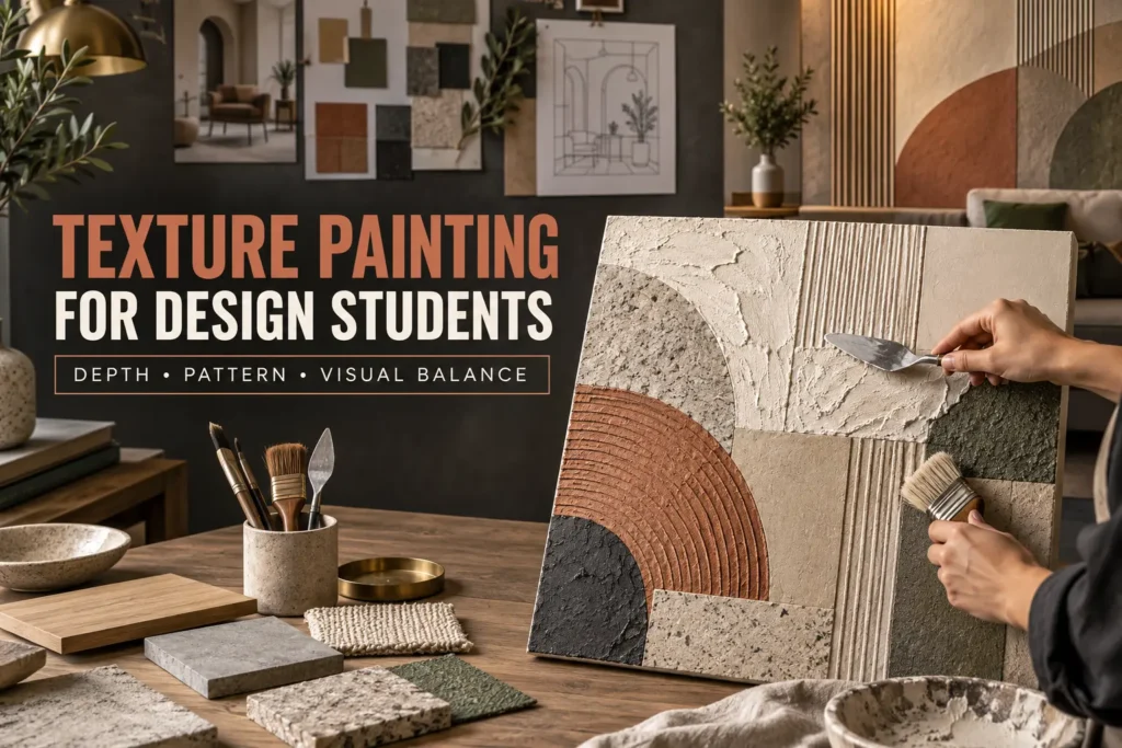
Table Of Content
- What Is Texture Painting?
- Physical Texture and Visual Texture
- Why Texture Painting Matters in Design Education
- Elements of Design Used in Texture Painting
- How Does Texture Painting for Design Students Create Depth?
- Understanding Pattern Through Texture
- Visual Texture Exercises for Design Students
- Step-by-Step Design Foundation Workshop Process
- From Texture Exercise to Interior Design Project
- Texture, Material and Scale
- Common Texture-Painting Mistakes
- How to Evaluate a Texture-Painting Exercise
- Watch a Texture-Painting Exercise
