

Salt painting for design students is a simple exercise that turns colour, texture and a familiar kitchen ingredient into an unpredictable piece of art. The process introduces beginners to colour blending, material behaviour and creative observation without requiring complicated equipment.
In a typical activity, a design is created using glue and salt. Watercolour or diluted paint is then applied to the raised salt lines. As the colour touches the surface, it begins to travel, spread and merge. Some results can be controlled, while others develop in unexpected ways.
That combination makes the exercise valuable for beginner designers. Students must plan the composition, choose a colour palette and handle the materials carefully. At the same time, they learn to respond when colour travels beyond the original plan.
Design is not always about forcing every element into perfect obedience. Sometimes the material has its own opinion, and the student’s job is to observe it intelligently.
What Is Salt Painting?
Salt painting is an art and design activity that uses salt to create raised lines, textured surfaces or spreading colour effects. One common method involves drawing with glue, covering the wet glue with salt and then applying liquid colour.
The salt absorbs the colour and carries it along the raised path. This produces soft blends, irregular edges and visible colour movement.
A basic salt-painting process may include:
- Planning a simple design
- Drawing the design with glue
- Covering the wet glue with salt
- Removing loose salt
- Applying liquid colour
- Observing how the colour spreads
- Allowing the work to dry
- Reviewing the final pattern and texture
The activity may be used to create geometric patterns, abstract lines, floral forms, lettering or material-inspired compositions.
Salt painting is easy to begin but difficult to control perfectly. That is exactly why it provides useful design learning.
Why Do Design Students Practise Salt Painting?
Beginner design education often includes small visual exercises that build observation, patience and material awareness. Salt painting offers all three.
It introduces colour movement
Students see how liquid colour travels through an absorbent surface. This makes colour blending visible rather than purely theoretical.
It encourages experimentation
Changing the amount of paint, water, salt or glue produces different results. Students can compare these results and identify useful methods.
It develops hand control
Applying glue in clear lines and placing colour carefully require steady movement and patience.
It makes accidents informative
A colour may travel farther than expected or merge with another shade. Students learn to review the result rather than immediately treating it as a failure.
It supports composition practice
The activity still requires balance, rhythm, proportion and focal points. Interesting texture cannot rescue a poorly organised layout.
It builds documentation habits
Students can photograph the stages, label test samples and note what changed between experiments. This approach supports later project development.
The exercise is low-pressure enough for beginners to explore but structured enough to teach genuine design principles.
Materials Needed for Salt Painting
The exact materials may vary according to the exercise, but students commonly work with the following items.
Base surface
Thick paper or board may provide a stable base for glue, salt and liquid colour. Thin paper can bend or weaken when it becomes wet.
The selected surface should be tested before the final exercise.
Adhesive
Glue creates the lines or shapes that hold the salt. The applicator opening affects line thickness and control.
Salt
Salt forms the textured path. Grain size, quantity and distribution can influence the final appearance.
Liquid colour
Watercolour or another suitable diluted colour can be applied carefully to the salt. Students should test how quickly it travels before beginning the final composition.
Brushes, droppers or applicators
A fine brush or dropper helps place colour without disturbing the surface. Different tools provide different amounts of control.
Pencil and eraser
A light drawing can guide the glue application. Heavy pencil marks may remain visible beneath the completed work.
Tray or protective sheet
A tray catches loose salt and keeps the workspace manageable. Otherwise, the exercise may continue under shoes and across the classroom for several days.
Paper towels and water
These support quick cleaning and controlled colour use.
How Salt Creates Colour Effects
Salt is absorbent. When liquid colour touches the salt line, the coloured water moves through nearby grains. This creates spreading, merging and uneven colour effects.
The final result depends on several variables:
- Amount of salt
- Salt-grain size
- Glue-line thickness
- Amount of colour
- Water-to-pigment balance
- Distance between colours
- Surface angle
- Timing
- Drying conditions
- Pressure used during application
Because several variables are working together, two apparently similar samples may not look identical.
Students should avoid expecting machine-like repetition. The useful learning lies in noticing why the results changed.
Salt Art Colour Effects
Salt art colour effects can range from clearly separated colour sections to gradual blends and unexpected mixtures. Students can use these changes to understand how colours behave next to one another.
Single-colour spread
Begin with one colour and watch how far it travels along the salt line. This provides a basic understanding of absorption and control.
Two-colour blending
Apply different colours at opposite ends of a line. As they move towards each other, they may create a transition or a mixed shade.
Warm-colour combination
Red, orange and yellow may create an energetic composition. Their closeness on the colour wheel can produce smoother visual relationships.
Cool-colour combination
Blue, green and violet can create a calmer impression, depending on their saturation and arrangement.
Complementary contrast
Colours positioned opposite each other on the colour wheel can create strong contrast. When mixed too heavily, however, they may lose clarity.
Light-to-dark movement
A lighter colour can be placed beside a darker variation to study value. This helps students understand that colour differences involve more than hue.
Controlled gaps
Leaving uncoloured areas between shades may prevent immediate mixing and create clearer divisions.
Accidental transitions
When two colours meet unexpectedly, students should observe the result. The mixture may create an interesting transition or an unclear area that needs better planning next time.
Calling every accidental blend “experimental art” is tempting, but useful experimentation still requires observation.
Understanding Controlled Accidents in Design
A controlled accident happens when the designer creates conditions for variation without giving up all planning.
In salt painting, students control:
- The base drawing
- Glue placement
- Salt quantity
- Colour selection
- Starting points
- General composition
They cannot fully control:
- The exact path of every drop
- How quickly two colours meet
- The shape of every salt grain
- Small variations during drying
This balance teaches an important design habit. Materials should be guided, but their natural behaviour should also be understood.
A student may discover a useful colour transition that was not planned. The next step is not simply to celebrate the accident. The student should ask:
- Why did it happen?
- Can it be repeated approximately?
- Does it improve the composition?
- Where could this effect be useful?
- How can unwanted versions be reduced?
Design learning begins when an unexpected result becomes a question.
Creative Colour Experimentation
Creative colour experimentation gives students space to move beyond basic colour-wheel definitions. Instead of only reading that blue and yellow create green, they can observe how colour strength, water and placement affect the mixture.
Hue
Hue refers to the basic colour family, such as red, blue or yellow.
Value
Value describes how light or dark a colour appears. Adding water may create a lighter visual effect, while stronger pigment may appear deeper.
Saturation
Saturation relates to colour intensity. A strong, vivid colour feels different from a muted version of the same hue.
Temperature
Colours are often described as warm or cool. Their temperature can influence mood and visual balance.
Harmony
Related colours can create a connected and comfortable composition.
Contrast
Different colours, values or temperatures can help one area stand apart.
Salt painting allows students to watch these qualities interact in real time. A colour may appear strong at the point of application and lighter as it travels through the salt.
Step-by-Step Salt Painting for Design Students
How Can Beginners Complete Salt Painting for Design Students?
Beginners can complete salt painting for design students by starting with a simple composition, preparing raised salt lines and adding liquid colour slowly. Small test samples should be made before attempting the final artwork.
Step 1: Select a learning objective
Decide what the activity should explore. Possible objectives include:
- Warm and cool colours
- Complementary contrast
- Colour gradients
- Geometric pattern
- Organic movement
- Light and dark values
- Symmetrical balance
- Abstract composition
One clear objective helps students evaluate the final result.
Step 2: Create small trials
Use a separate sheet to test the glue, salt and colour. Check how thick the glue line should be and how quickly the paint travels.
A five-minute test can prevent an hour-long final artwork from becoming a colourful puddle.
Step 3: Plan the composition
Make a light pencil drawing. Keep the forms clear and avoid excessive detail during the first attempt.
Consider:
- Main focal point
- Direction of movement
- Areas of pattern
- Empty space
- Colour placement
- Overall balance
Step 4: Apply the glue
Follow the pencil lines using controlled pressure. Try to maintain a suitable and reasonably consistent line.
If the design includes intersections, consider how colour may travel between them.
Step 5: Add salt
Place enough salt over the wet glue to cover it. Work over a tray or protective surface.
Allow the salt to settle, then remove the excess carefully without disturbing the design.
Step 6: Prepare the colours
Mix the selected colours and test their strength. Very watery colour may travel quickly, while a different consistency may behave differently.
Keep the palette limited during a beginner exercise. Sixteen colours may look exciting in the containers and become less exciting when they all meet in the middle.
Step 7: Apply the first colour
Touch the brush or dropper gently to the salt. Avoid rubbing the surface because this may disturb the grains.
Watch how the colour moves before adding more.
Step 8: Add neighbouring colours
Place the next colour at a planned distance. Observe whether the shades blend, remain separate or create an unclear transition.
Step 9: Allow the work to dry
Keep the artwork flat and avoid touching the salt while the surface remains wet.
Step 10: Review the composition
Once dry, examine:
- Colour relationships
- Line quality
- Texture
- Balance
- Unplanned blends
- Empty areas
- Strongest focal point
- Possible improvements
Step 11: Record the process
Write down the materials, colour combinations and problems. This turns the activity into a reusable design study.
Beginner Design Activity Ideas
A beginner design activity should be simple enough to complete but open enough to encourage individual choices.
Geometric pathway
Create connected circles, triangles or squares. Apply different colours and observe how they travel through the joining points.
Colour wheel interpretation
Arrange colours in a circular composition. Use the salt lines to observe transitions between related shades.
Abstract landscape
Use curved horizontal lines to suggest land, water and sky. Focus on value and temperature rather than realistic drawing.
Leaf pattern
Develop a repeated organic motif. Change the colour arrangement while keeping the basic form consistent.
Mood composition
Choose a word such as calm, energetic, joyful, crowded or quiet. Express the mood through colour and line.
Symmetry experiment
Create a balanced pattern on both sides of a central line. Compare the planned symmetry with the natural colour variation.
Material-inspired design
Observe marble, stone, terrazzo, fabric or another surface. Use salt painting to create an abstract interpretation.
Room-colour concept
Select colours for an imaginary interior space. Arrange them according to their planned visual importance.
These exercises should encourage students to explain their decisions. “I liked these colours” is a valid starting point, but design development needs a little more detail.
Visual Balance in Salt Painting
Visual balance refers to how colour, texture and shapes distribute attention across an artwork.
Symmetrical balance
Both sides contain similar visual weight. The elements do not need to be completely identical, but they feel evenly arranged.
Asymmetrical balance
Different elements balance one another. A large pale shape may be balanced by a smaller area containing a strong colour and dense texture.
Radial balance
Elements move outwards from a central point. Circular salt-painting designs can demonstrate this clearly.
Colour balance
A strong colour can dominate even when it covers a small area. Students need to consider intensity as well as size.
Texture balance
Raised salt lines attract attention because they create shadows and surface variation. Too much texture in one corner may make the composition feel heavy.
A useful method is to photograph the work and view it in a smaller size. Imbalance often becomes easier to notice when the student is no longer staring at individual salt grains.
Pattern and Rhythm in Salt Art
Pattern develops through repetition, while rhythm describes how that repetition guides the eye.
Students can create rhythm by repeating:
- Colours
- Lines
- Shapes
- Spacing
- Curves
- Dots
- Direction
- Texture density
A regular rhythm feels organised and predictable. A gradual or alternating rhythm may feel more active.
Salt painting introduces natural variation within repeated forms. Even when the same motif appears several times, the colour spread may differ slightly. Students can use this variation to keep the pattern lively without losing its overall structure.
Positive and Negative Space
Positive space contains the main shapes, lines and colours. Negative space is the area around and between them.
Beginners sometimes feel that every blank area needs filling. In reality, negative space can:
- Separate colours
- Improve readability
- Create visual rest
- Strengthen the focal point
- Prevent the design from becoming crowded
- Help the raised lines stand out
Students should plan empty space rather than leaving it accidentally. A clear unpainted area can be more useful than one final decoration added because the corner “looked empty.”
Common Salt-Painting Problems
The salt does not stay on the line
The glue may have started drying before the salt was added, or parts of the line may not contain enough adhesive.
Work in manageable sections and cover the glue while it remains wet.
The colour does not travel
The salt, paint consistency or surface preparation may not support the expected movement. Test the materials and adjust one factor at a time.
The colour spreads too far
Too much liquid may have been applied. Begin with a small amount and observe it before adding more.
Different colours become muddy
Several colours may have mixed within a small area. Increase the distance between them, reduce the amount of liquid or simplify the palette.
The paper bends
The base may be too thin for the amount of glue and liquid used. Select a stronger surface and control moisture during the next attempt.
The glue lines look uneven
Pressure may have changed during application. Practise lines separately before starting the final drawing.
The design breaks after drying
Salt painting can remain delicate. Handle the completed exercise carefully and document it through clear photographs for presentation.
The result does not match the plan
Review which changes were caused by material behaviour and which came from application errors. Not every difference needs correcting. Some may improve the visual result.
How to Evaluate the Final Exercise
Students can review their work using a simple checklist.
Design area | Questions to ask |
Colour | Do the colours blend clearly, or have they become unclear? |
Contrast | Is there enough difference between important areas? |
Balance | Does one side feel unnecessarily heavy? |
Pattern | Is the repetition organised and readable? |
Texture | Do the raised lines support the composition? |
Focal point | Where does the eye look first? |
Space | Are empty areas used intentionally? |
Technique | Which parts were controlled successfully? |
Experimentation | What unexpected result was useful? |
Improvement | What would change in the next version? |
Evaluation helps students separate personal preference from design reasoning. A student can like a colour combination while still recognising that the composition needs stronger balance.
Applying Salt-Painting Lessons to Interior Design
Salt painting itself may remain a workshop exercise, but the principles it introduces are relevant to interior design.
Colour schemes
Students can compare related, contrasting, warm, cool or neutral colour combinations before using them in a room concept.
Material observation
The raised and irregular surface encourages students to notice texture, shadow and depth.
Feature-wall ideas
Abstract lines and colour transitions may inspire mural, panel or wall-finish concepts. Actual application would require suitable material and technical planning.
Pattern development
A small salt motif can become the starting point for tiles, screens, rugs, soft furnishings or decorative panels.
Concept boards
Photographed sections of the artwork may contribute to a mood or colour story.
Model-making
The exercise can help students think about textured surfaces, although the chosen texture must suit the scale of the model.
Visual storytelling
Colour movement can express ideas such as calmness, energy, transition or contrast within a presentation.
The workshop result does not need to become a literal interior product. Sometimes its main value lies in the colour and composition lessons it reveals.
From Texture Exercise to Interior Design Project
A classroom texture sheet becomes useful when the student understands how to apply the learning.
Concept boards
Painted textures can support the mood of an interior concept. Rough neutral surfaces may suit one direction, while smooth reflective effects may support another.
Material presentation
Students can use painted representations when actual samples are unavailable or when they need to show a broader visual idea.
Interior sketches
Texture distinguishes materials within a drawing. Without it, a timber panel, stone wall and fabric surface may look almost identical.
Model-making
Physical texture techniques can help represent surfaces in scaled models. However, the size of the texture must suit the model scale.
Wall and surface concepts
Pattern and texture studies may inspire feature walls, panels, screens or artwork.
Furniture and product details
Students can apply visual patterns to furniture surfaces, partitions, storage units or decorative objects.
Portfolio development
Including process work shows how a student reached the final design. This can communicate observation, experimentation and decision-making more clearly than a finished image alone.
Watch Salt Painting as a Colour Experiment
Youtube Video : https://www.youtube.com/shorts/kXm0lwTaVtk
Watch this short salt-painting colour experiment to see how colour moves across a raised salt surface and creates blends that are partly planned and partly unexpected.
While watching, observe:
- How the initial design is organised
- How the salt lines are prepared
- How much colour is applied
- Where different shades meet
- Which areas remain separate
- How the texture changes the final appearance
The finished artwork may attract attention first, but the learning sits in the process. Notice how every small material decision changes the result.
From a Colour Exercise to a Design Portfolio
A salt-painting activity can become a useful portfolio page when the process is presented clearly.
Students may include:
- Project title
- Learning objective
- Initial sketch
- Colour palette
- Material list
- Trial samples
- Process photographs
- Final artwork
- Close-up texture image
- Design application
- Reflection notes
The application could show how a colour combination might influence an interior concept, artwork, feature wall, textile or decorative pattern.
The portfolio page should remain easy to follow. A clean layout with selected images communicates more effectively than fitting every test photograph onto one sheet.
Students should explain what they learned about colour movement and control. This reflection gives the exercise purpose beyond the final visual.
Learning Design Fundamentals at ISFT
ISFT’s Diploma in Interior Design includes Basic Design Fundamentals, Workshop and Visual Study, space-planning fundamentals, freehand sketching, measured drawings, graphics, building materials, construction, design history and an introduction to CAD.
These subjects help students connect creative exercises with interior-design communication and planning. A colour experiment may improve visual awareness, while sketching, materials and space planning help students apply that awareness within a project.
The diploma has a duration of one year and is open to students who have passed Standard XII in any discipline. Its curriculum is divided across two semesters and combines theoretical understanding with practical-level skills.
Students interested in building a foundation in interior design can review the one-year Interior Design Diploma and speak with the ISFT admissions team for current information about the curriculum and application process.
Conclusion
Salt painting for design students turns a simple material experiment into a lesson in colour, pattern, texture and observation. The activity helps beginners see how colour moves, how neighbouring shades interact and how unexpected results can influence a composition.
Start with a small trial sheet, a limited palette and one clear objective. Record the colour combinations, application method and changes noticed after drying. The aim is not to control every salt grain. It is to understand which decisions can be controlled and how to respond intelligently to the rest.
ISFT’s Diploma in Interior Design connects basic design, visual study and creative presentation with space planning, materials, sketching and CAD. Students interested in building practical interior-design foundations can review the course details and discuss the programme with the ISFT admissions team.
FAQs
1. What is salt painting for design students?
Salt painting for design students is a hands-on colour and texture exercise using salt, adhesive and liquid colour. Students create raised lines and then observe how paint travels across the absorbent surface. The activity introduces colour blending, pattern, visual balance and material behaviour. It also teaches students to evaluate unexpected effects instead of assuming that every variation is a mistake.
2. Is salt painting suitable for beginner designers?
Yes. Salt painting is suitable for beginners because the basic process is easy to understand and encourages experimentation. Students should start with a simple pattern, limited colour palette and small test sheet. The exercise still requires patience and careful application. Beginners can gradually move from single-colour lines to blended, geometric or material-inspired compositions after understanding how the colour travels.
3. What type of colour can be used for salt painting?
Liquid colours that can move through the salt are commonly explored during this activity, but the chosen paint, salt, adhesive and base surface should be tested together. Different consistencies may produce different results. Students should prepare a small sample before starting the final composition and follow any workshop instructions related to material selection, preparation, handling and cleaning.
4. Why do salt-art colours sometimes become muddy?
Colours can become muddy when too many shades mix in a small area or when excessive liquid carries them into one another. Complementary colours may also lose clarity when heavily blended. Students can use fewer colours, place them farther apart or apply less liquid. Trial samples help determine where two shades should meet and where a gap may provide better control.
5. What can creative colour experimentation teach interior-design students?
Creative colour experimentation helps students understand hue, value, saturation, temperature, contrast and harmony. It also shows how colours can influence mood and visual attention. These observations may later support interior concept boards, drawings, pattern ideas and material presentations. The exercise does not decide a complete interior scheme, but it gives students a practical foundation for making more considered colour choices.
6. How can salt painting be included in a student portfolio?
Students can include the initial concept, colour palette, trial samples, process photographs, final artwork and a possible design application. They should add a short reflection explaining which effects were controlled, what happened unexpectedly and what they would change. A close-up photograph can show the surface clearly, while an interior sketch or material board can connect the exercise with a broader project.
7. What should students do when the result looks different from the plan?
Students should first identify why the result changed. The cause may involve colour quantity, water, salt distribution, glue thickness or timing. They should decide whether the unexpected effect improves the composition or weakens it. Recording the cause makes the experiment useful. The next sample can then repeat the positive effect or reduce the unwanted one through a more controlled process.
8. Does ISFT’s Diploma in Interior Design include foundation subjects?
Yes. ISFT’s Diploma in Interior Design includes Basic Design Fundamentals, Workshop and Visual Study, space planning, freehand sketching, measured drawings, graphics, building materials, construction and design history. It also introduces students to CAD. Learners should review the current programme page and contact ISFT directly for complete information about the curriculum, eligibility and admission process.
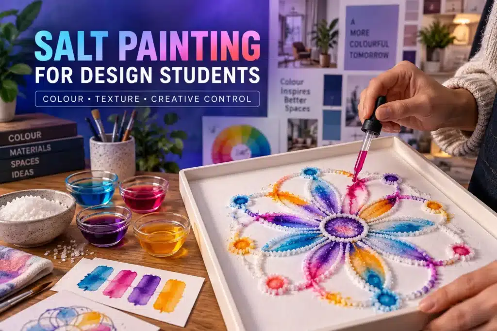
Table Of Content
- What Is Salt Painting?
- Why Do Design Students Practise Salt Painting?
- Materials Needed for Salt Painting
- How Salt Creates Colour Effects
- Understanding Controlled Accidents in Design
- How Can Beginners Complete Salt Painting for Design Students?
- Pattern and Rhythm in Salt Art
- Applying Salt-Painting Lessons to Interior Design
- Watch Salt Painting as a Colour Experiment
- Learning Design Fundamentals at ISFT
